


If you don’t regularly read the Health Populi blog written by Jane Sarasohn-Kahn, then you’re really missing out on some great insights into what’s happening with the economics of healthcare. I’m not sure if I’d just missed some of her writings previously, or if she’s really been writing a lot more lately but I regularly find myself chewing on the healthcare economic data she presents.
Today’s post about US National Healthcare Spending is a great example. You can go and read all the insights she offers, but the two charts she shares really stood out to me.
The first chart shows the growth in per capital health care expenditure from 2004-2014.
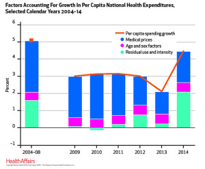
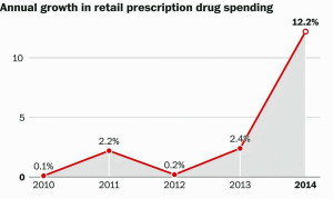
That’s a massive jump from the drop in health care costs we saw in 2013 to the 5.3% increase in healthcare costs in 2014. It seems like most of the increase in cost comes from all of the newly covered ACA (Obamacare) patients. However, this chart also tells an interesting story about spending on drugs:
We’re going to have to carefully watch these trends over time. Both of them are quite scary to me. What do you think of these charts?


John, thanks so much for being a faithful reader! I appreciate your sharing my posts with your readers. These were indeed sobering numbers….the post-recession health economy now sees inflation for healthcare rising much, much faster than both the consumer-price index overall, and workers’ wages — where healthcare is taking much greater bites of houeshold spending. Take care….and thank you!
Jane,
You’ve been putting out such great content lately. It’s irresistible.
I feel first hand the increase in healthcare costs. My insurance costs as a small business have increased by 4 times and it feels like I’m paying more for each visit as well. It’s been brutal from my and my other entrepreneur friends’ perspectives.
Great charts! John, thanks for putting me on to Joan in this post. I saw that 12.2% drug number earlier today and yup, it’s crazy. More high-cost biotech drugs and all those uncovered people now in Medicaid using services. Hmmm, who’s going to pay? Who is going to go without? Your own personal story, John, brings to mind the word “unsustainable”.