The following is a guest post by Carl Bergman from EHR Selector.
The Obama administration’s, Challenge.gov site encourages the public to submit suggestions that solve specific, public policy questions. To do this, it’s set up dozens of contests or challenges. For example, the FTC has a $50,00 challenge for a solution to illegal robo calls that often come from off shore.
In healthcare, the VA and the ONC recently ran a Health Design Challenge for a better patient health record announcing the winners a few days ago.
The challenge asked for a record that:
- Improves the visual layout and style of the information from the medical record
- Makes it easier for a patient to manage his/her health
- Enables a medical professional to digest information more efficiently
- Aids a caregiver such as a family member or friend in his/her duties and responsibilities with respect to the patient
The entries were judged by a twelve person panel ranging from Wired Magazine’s Executive Editor, Thomas Goetz to Facebook’s Product Designer, Nicholas Felton to Dr. Sophia Chang, the director of the Chronic Disease Care program of the California Health Care Foundation. They looked at several features of a revamped record from overall appeal to how readily it shows important information and how accessible it is for physicians, patients, etc.
The Winners
The judges picked three big winners and three winners in the Problem History, Medication and Lab Summaries areas. Here’s a brief look at the top entries, but the submissions should be looked at more as a resource than a race result, as I’ll discuss.
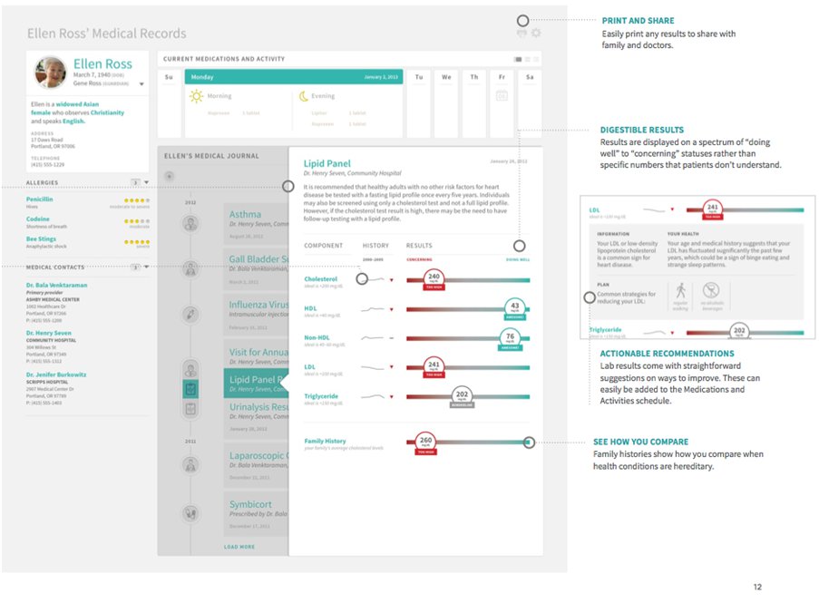
First place went to Nightingale an anonymous group that won $16,000. Others won smaller amounts. In the next few months, elements of the winning designs will be put together and put up on Github.
Nightingale’s design stressed that health was a continuing concern and that a user should be able to see an improving or declining trend without having to dig for the data. They did this by integrating the often disparate information in visits, exams and lab results. You can see this emphasis in their lipid panel screen. Sliders place each test result for each test’s in a range. Good results slide to green while poorer result move to red.
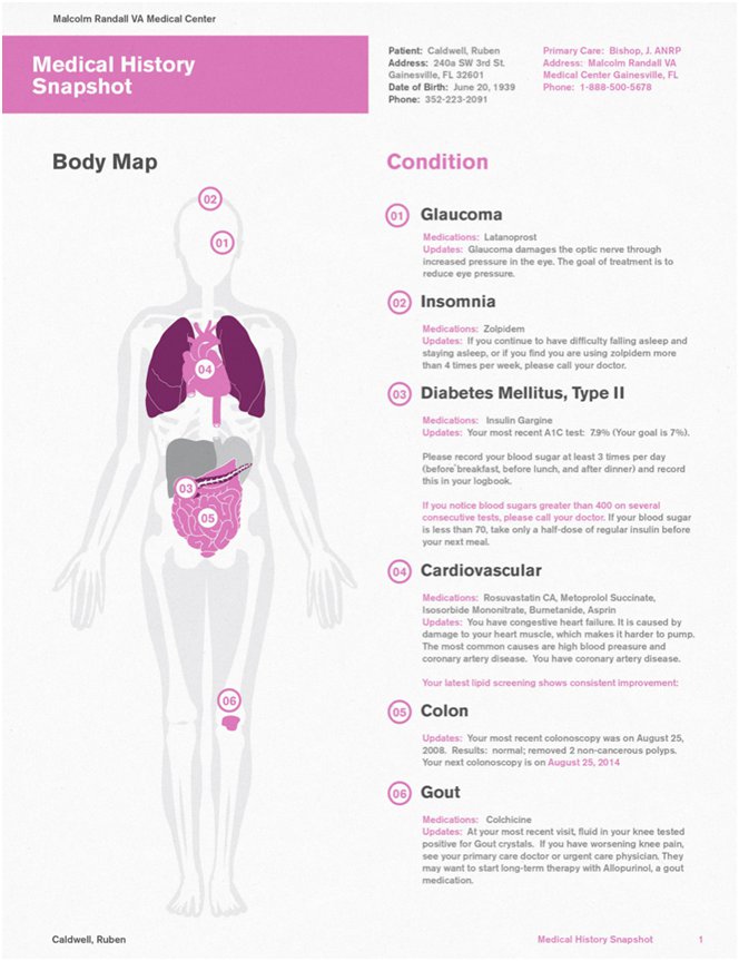

Second place StudioTACK took a somewhat similar approach to creating a problem history, which they call a medical strategy rather than a record. They did this by bringing their findings into a body map with references to location and organ.
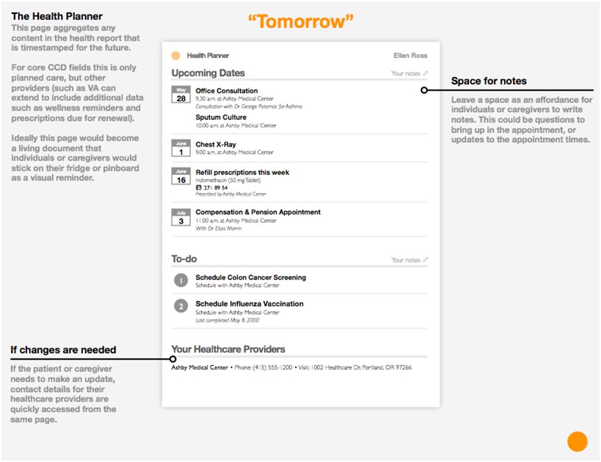
Matthew Sanders’ CCD scored the best Problem History section award. Sanders rearranged and redesigned the traditional note not by condition nor by past chronology, but into a timeline of past, present and future actions. While he admits that his approach is somewhat redundant for meds, he emphasizes that this arrangement helps all the users maintain a focus on the most important areas for action. Sanders presentation notably describes how he implemented his approach. To do this, he stripped out standard label text, clarified terms and gave the remaining items visual emphasis. This type of analysis makes going through the submissions worth it.

This isn’t to say that the way the contest was run and the approach of many submissions — including some prize winners — were without shortcomings. There were some notable problems.
The Contest’s Problems
The contest’s operators needed to be far more specific about what they wanted and how they judged the results.
The challenge’s purpose was far from clear:
The purpose of this effort is to improve the design of the medical record so it is more usable by and meaningful to patients, their families, and others who take care of them. This is an opportunity to take the plain-text Blue Button file and enrich it with visuals and a better layout. Innovators will be invited to submit their best designs for a medical record that can be printed and viewed digitally.
A medical record is an on going repository of a person’s health context, status, prognosis, plans, etc. It has many contributors and users. The VA’s Blue Button is a snapshot of the person’s status for their use. However, the contest uses these terms interchangeably. Due to this muddle, many of the submissions sent in designs for a medical record, while others, a minority, only redid the Blue Button’s outline. Thus, not all submissions were developed on the same basis. Indeed, the judges seem to acknowledge this since they gave first place to Nightingale, which claims, “to be a new take on health records.” The contest would have done much better if it asked for particular types of screens putting everyone on the same page, as it were.
The contest judging panel while distinguished, had no practicing physicians, nurses or practice managers, a significant failing. While three of the twelve judges are MDs, not one is a practicing physician.
Finally, if you’re going to hand out $50,000 in public funds, you might just want to say why you thought the winners stood out.
The Submissions
The contestants almost universally got one thing right. They designed their entries for desktops/laptops, pads and phones. They showed a great understanding that we don’t work on just one platform, but move from one to the other almost continuously. In this, they deserve much praise. However, all this cross platform awareness is done in by an appalling over, under and misuse of font color, and size. As one post noted about Nightingale:
The text is too small and medium gray on light gray is very hard to see, especially for older people and people on cheap computers with low contrast displays. How can this possibly be the first place winner?
The comment is generous. Nightingale’s gray on gray font is almost unreadable. Granted their submission is a PDF of a prototype, nonetheless the possibility of staring at their screens all day would give me a headache.
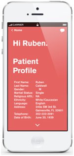
They are not alone in color misuse. Second place winner, Studio TACK, goes to excess the other way with a white text on red iPhone screen. It’s more suited to public safety than health.

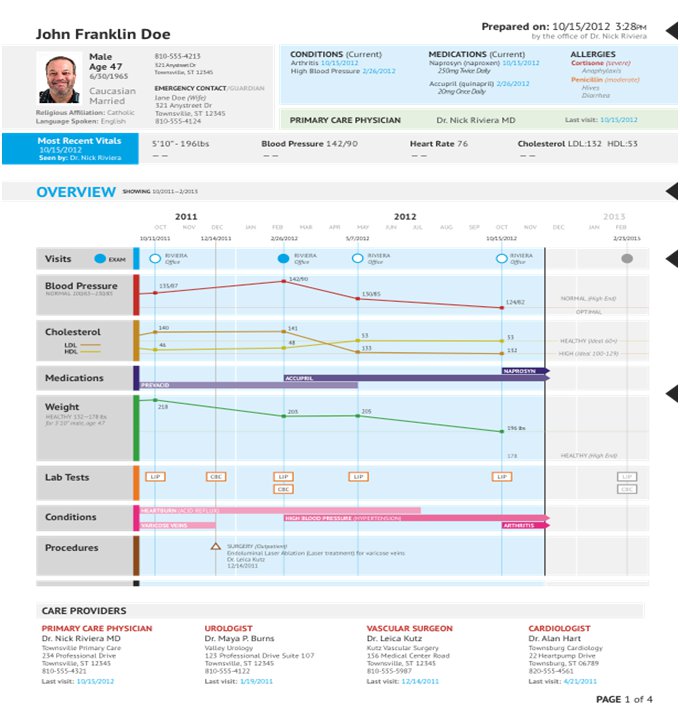
Going through the submissions, however, can be most rewarding. I found a gem of a summary page in Uncorkit’s submission. Their infographic approach puts not only labs and weight history on timelines, but also includes BP, conditions and meds. It gives you a great overview and a logical place to drive down for detail information without overwhelming your senses.
The Health Challenge submissions have much to recommend them. Just remember how they came about and what they may or may not include.
